Creating Approved Email Content in Content Studio
Content creators can use Content Studio to quickly and easily create, preview, test, and deploy Approved Email content. This feature replaces limited manual publishing workflows with an interactive, visual editor and automated Vault deployment tools, lowering the cost of content creation and administration within the Content Supply Chain.
Currently, content creators can only create email templates. Support for creating fragments and template fragments (email footers) is planned for a future release.
Who can use this feature?
- Content Creators – Browser
- Managing Content
- Creating Email Templates
- Assembling Content in the Editor
- Previewing and Testing Content
- Deploying Content to Vaults
- Users do not require an additional license
Configuring Content Studio for Approved Email for
 All Users
To configure this feature:
- Ensure Configuring Content Studio is complete.
- Navigate to Admin > Users & Groups > Permission Sets.
- Select the appropriate Permission Set.
- Select the Application tab.
-
Select the following checkboxes:
- Create Email Template
- Delete Email Template
Managing Content as
Content Creators
To view, filter, and manage existing content, navigate to the appropriate content type tab in the navigation menu.
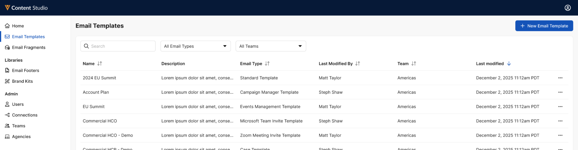
From the content type tab, users can use the following functionality to identify the appropriate content:
- Search – Searching across the Name and Description fields is supported
- Sort – Select any column header to sort the list of displayed content by that column
-
Filter – The following filters are available:
- Type – Enables filtering based on the object type of the content
- Teams – Filters the list based on team ownership. See Content Studio Team Management for more information.
Creating Email Templates as
Content Creators
To create email templates in Content Studio:
-
Navigate to the Email Templates tab in the navigation menu.
- Select the + New Email Template button.
-
Populate the following fields:
- Name – Enter the email template name
- Select a Vault CRM Connection – Select the appropriate Vault CRM connection. See Content Studio Connection Management for more information.
- Select a Content Management Connection – Select the appropriate PromoMats or MedComms connection. See Content Studio Connection Management for more information.
- Email Type – Select the appropriate object type
- Description – Enter an optional description
-
Select Create.
The new email template displays in the Canvas view, enabling content creators to quickly arrange and compose the content. See Assembling Content in the Canvas for more information.
Editing Email Template Properties
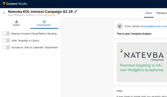
Select the Email Properties tab in the navigation menu to view and edit the following properties:
- Require Consent Check Before Sending – Select this toggle to require recipients of the email template to have valid consent before sending
- Hide Template in Library – Hides the email template from selection in the list of email templates when composing Approved Emails
- Include an “Add to Calendar” Attachment – Automatically inserts the {{addToCalendar}} token, which inserts an .ICS attachment for recipients to add to their calendars. This is useful when creating email templates that serve as invitations to events.
Editing Header Properties
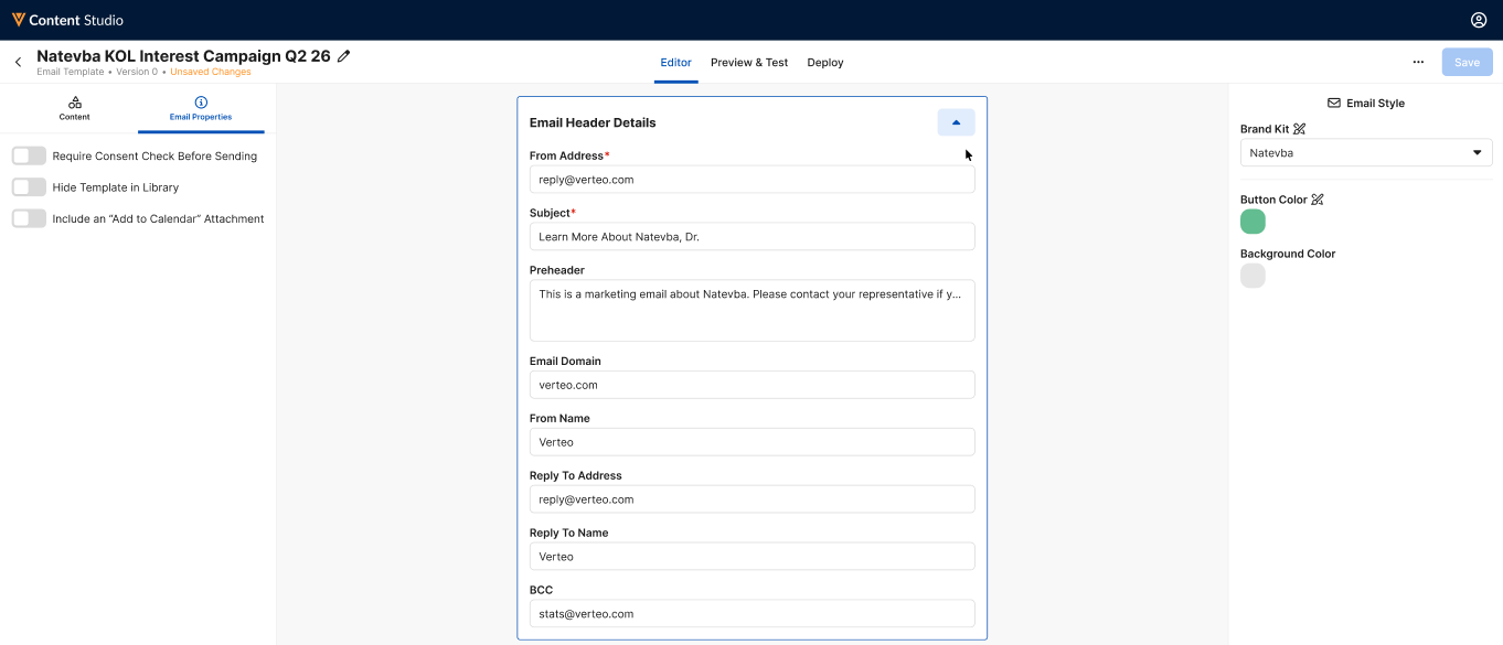
Select the Edit Header Details at the top of the Editor view to edit the following email template properties:
- From Address
- Subject
- Preheader
- Email Domain
- From Name
- Reply To Address
- Reply To Name
- BCC
Assembling Content in the Editor as
Content Creators
The Editor view is the primary view for a piece of Approved Email content, and enables content creators to quickly and easily compose content by adding text, images, tokens, and sections.
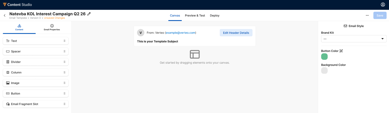
To add content, drag the appropriate element from the Content menu to the appropriate place in the content. Content creators can add the following elements:
- Text Sections
- Spacer Sections
- Divider Sections
- Column Sections
- Images
- Buttons
Adding Text Sections
Content creators can add rich text to content by dragging and dropping the Text element in the appropriate place in the content.
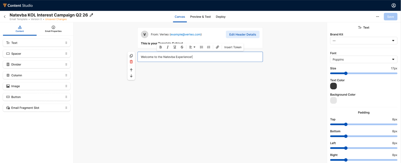
The inline editor enables basic rich text formatting, as well as the ability to insert tokens. When editing this section, the side menu enables content editors to define the following properties:
- Brand Kit – Enables content creators to select and apply the appropriate brand kit
- Font
- Size
- Text Color
- Background Color
- Padding
Adding Spacer Sections
Spacer sections are intentional whitespace added to content to improve scannability and blocking. Content creators can add spacers to content by dragging and dropping the Spacer element to the appropriate place in the content.
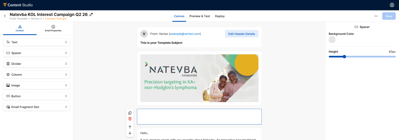
When editing this section, the side menu enables content editors to define the following properties:
- Background Color
- Height
Adding Divider Sections
Similar to spacers, dividers help improve scannability and blocking. However, dividers display as horizontal lines in the content, providing an even stronger break between sections of content. Content creators can add dividers to content by dragging and dropping the Divider element in the appropriate place in the content.
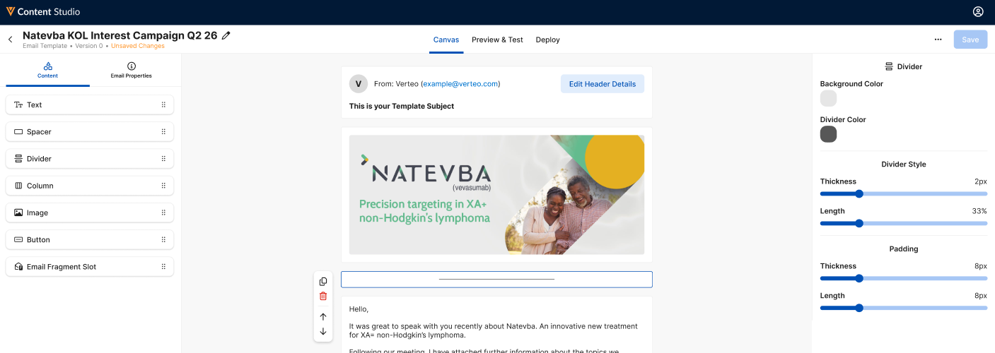
When editing this section, the side menu enables content editors to define the following properties:
- Background Color
- Divider Color
- Divider Thickness
- Divider Length
- Padding Thickness
- Padding Length
Adding Column Sections
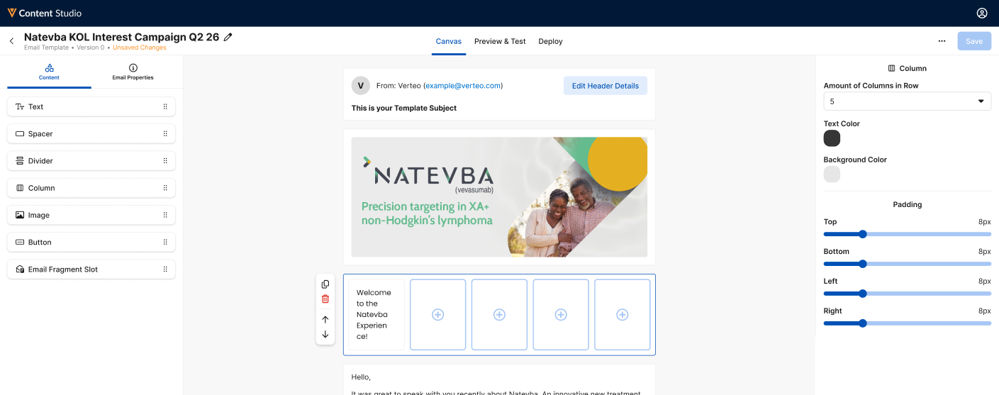
Column sections enable creating columns in the content. Content creators can add columns to content by dragging and dropping the Column element in the appropriate place in the content.
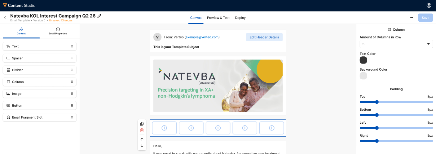
When editing this section, the side menu enables content editors to define the following properties:
- Amount of Columns in Row – Select the appropriate number of evenly spaced columns to add
- Text Color
- Background Color
- Padding
Each column can have other content sections placed within them, enabling the creation of richer content.
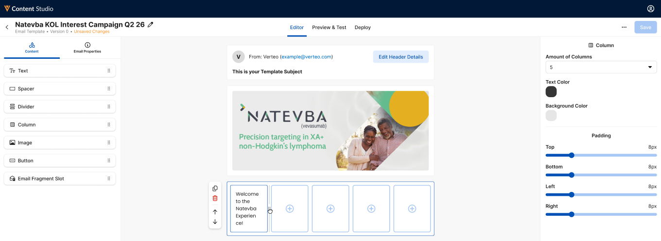
Content creators can proportionally resize specific columns by clicking and dragging the border between the appropriate columns.
Adding Images
Content creators can add images to their content by dragging and dropping the Column element in the appropriate place in the content.
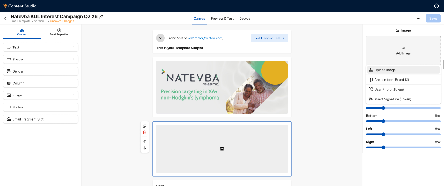
When editing this section, the side menu enables content editors to define the following properties:
-
Add Image – The following options are available:
- Upload Image – Enables content creators to upload an image from their computer
- Choose from Brand Kit – Enables selecting an image from the associated brand kit
- User Photo (Token) – Inserts the {{userPhoto}} token, which resolves in Vault CRM to the end user’s photo defined in the My Profile tab
- Insert Signature (Token) – Inserts the {{insertSignature}} token, which can be used to provide a photocopy of a signature obtained as part of sending the Approved Email in Vault CRM
- Background Color
- Padding
Adding Buttons
Buttons are styled links to external URLs. Content creators can add buttons to content by dragging and dropping the Button element in the appropriate place in the content.
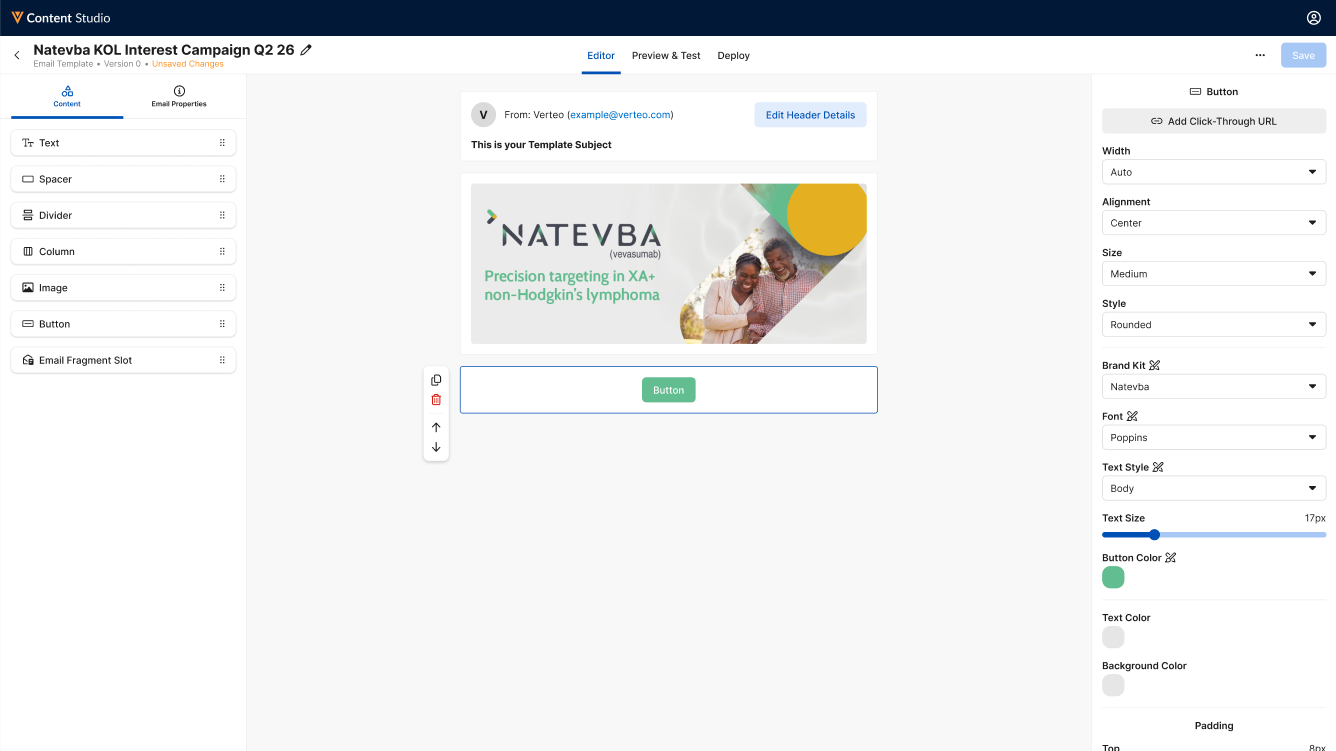
When editing this section, the side menu enables content editors to define the following properties:
- Add Click-Through Link – Enter the appropriate link
- Width
- Alignment
- Size
- Style
- Brand Kit – Enables automatically populating certain properties based on an associated brand kit
- Text Style
- Text Size
- Button Color
- Text Color
- Background Color
- Padding
Adding The Email Fragment Slot
Content creators can drag and drop the Email Fragment Slot element to designate where end users can add email fragments to their Approved Emails in Vault CRM.
This element is only available when creating or editing email templates.
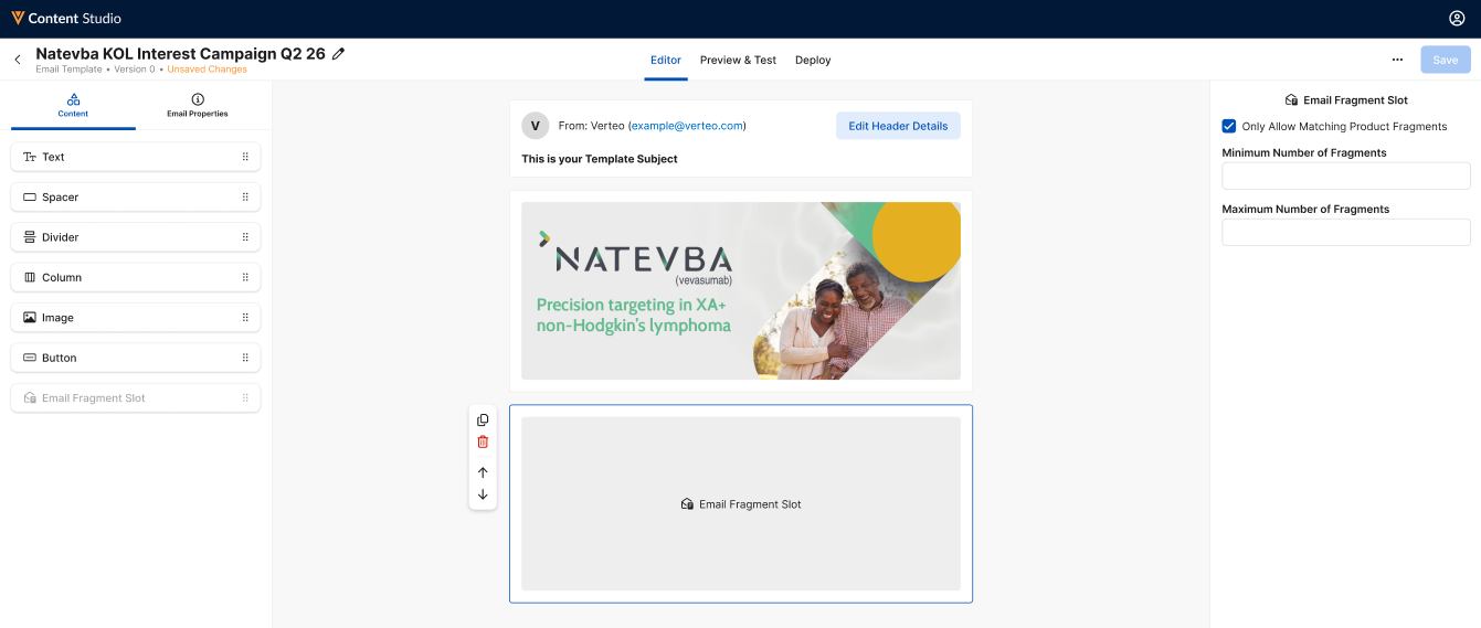
When editing this section, the side menu enables content editors to define the following properties:
- Only Allow Matching Product Fragments – Select this checkbox to restrict end users to only adding fragments with a matching associated product as the email template
- Minimum and Maximum Number of Fragments – Enables defining a minimum and maximum number of fragments that can be added. To allow an unlimited maximum number of fragments, enter 0 as the maximum, or leave the maximum parameter blank. To enable adding fragments with no minimum or maximum limits, leave both parameters blank.
Only one Email Fragment Slot can be added per email template.
Copying and Rearranging Elements
When an element is selected, the toolbar displays to the left of the section.
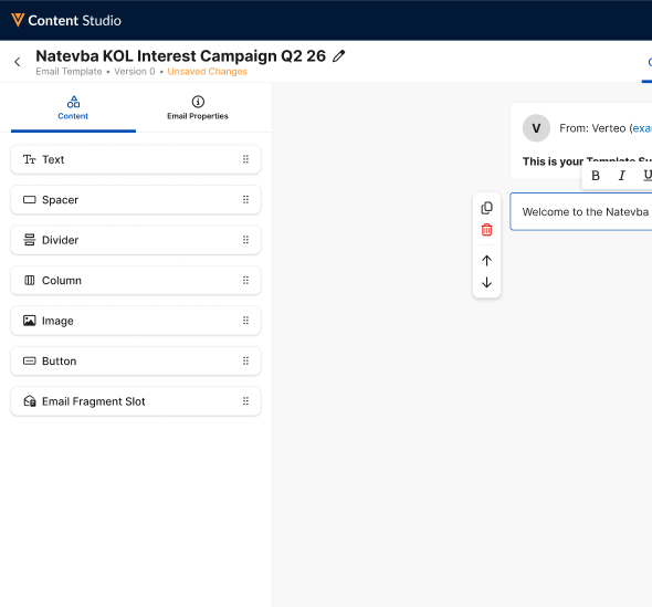
This toolbar enables content creators to perform the following actions:
- Duplicate Element (
 ) – Select this button to duplicate the selected element
 - Delete Element (
 ) – Select this button to delete the selected element
 - Move Element (
 ) and (
 ) – Select these buttons to move the selected element up or down in the content’s structure
Previewing and Testing Content as
Content Creators
Content creators can preview their content, as well as send the content as a test email, to ensure the content looks and functions as expected prior to deployment:
-
Navigate to the appropriate piece of content.
- Select the Preview & Test tab.
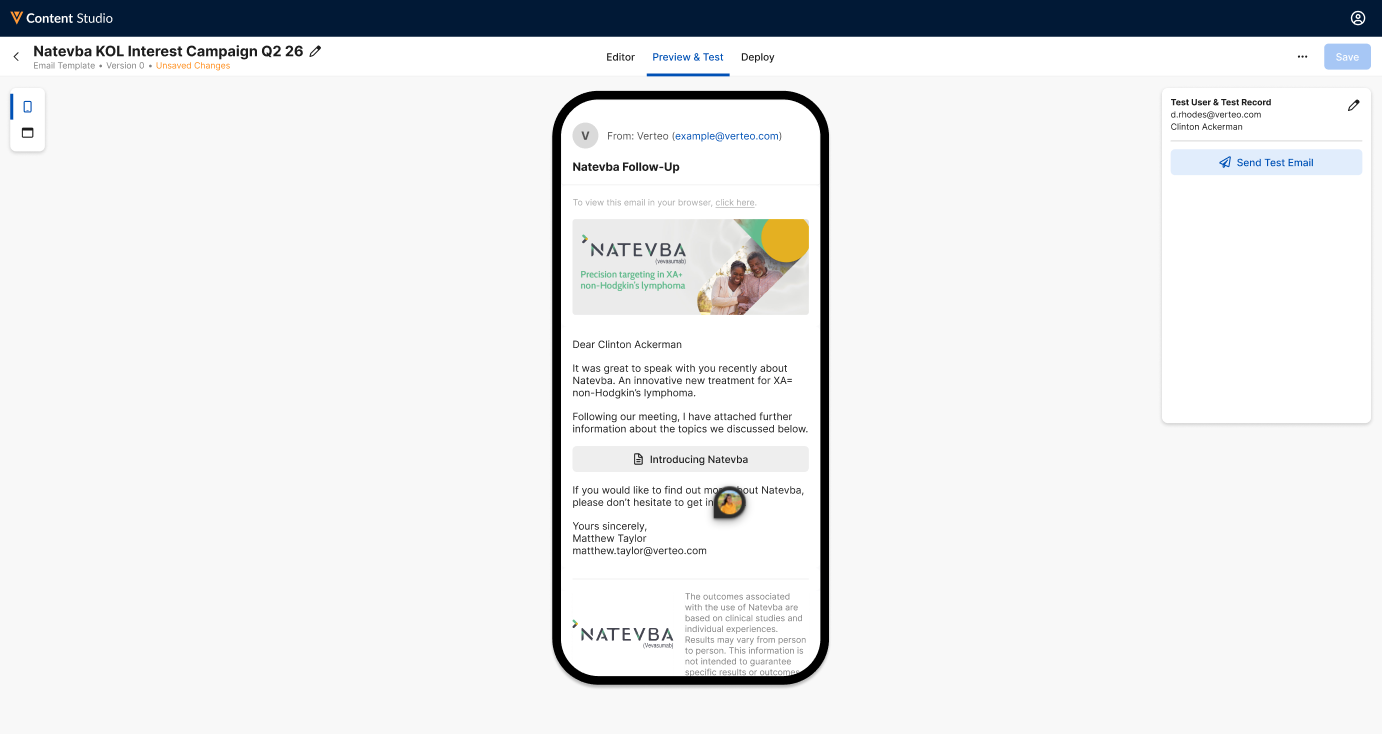
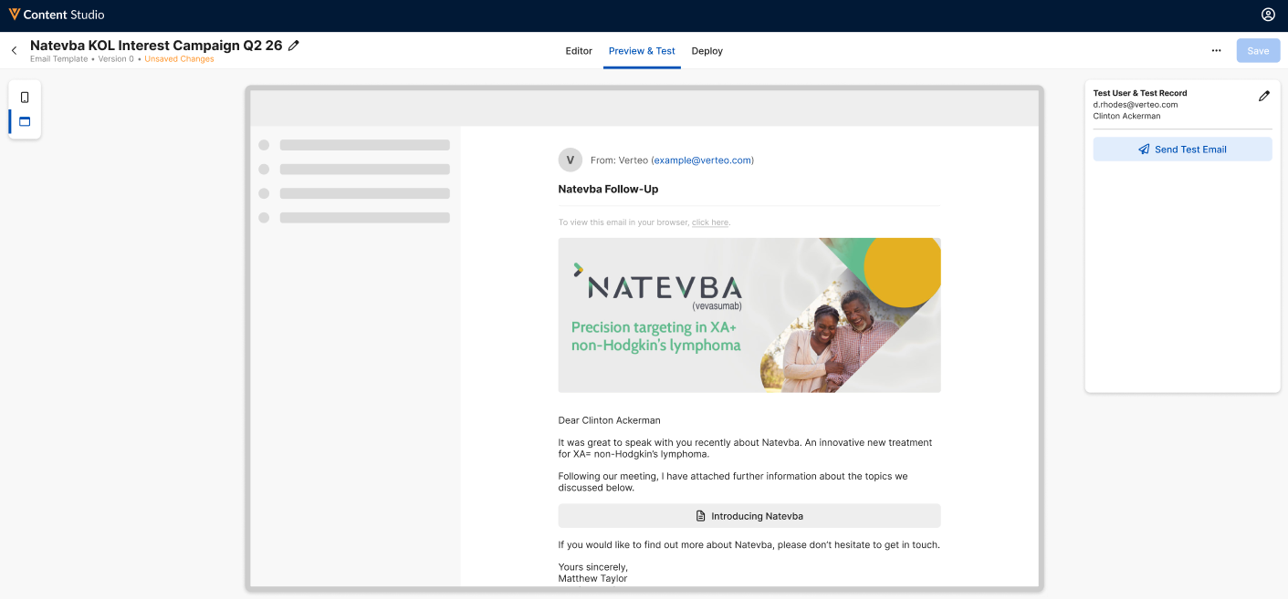
By default, the content is previewed from a mobile device, within a standard smartphone device frame. Select the Desktop ( ) button to switch the view to a standard desktop view.
Defining the Test User and Test Record
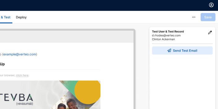
To ensure that tokens within the template resolve correctly, content creators can select a test user and test account within the preview. User and account-related tokens resolve based on the selected test user and account:
-
Navigate to the Test User & Test Record section.
- Select the Pencil (
 ) button.
 - Select the appropriate test user and test record. See Managing Test Users for a Vault CRM Connection for more information.
- Select Save.
Sending Test Emails
Content creators can also send test emails of created email templates, ensuring all aspects of the email template display and function correctly before deploying the content to Vault CRM:
-
Navigate to the Test User & Test Record section.
-
Select Send Test Email.
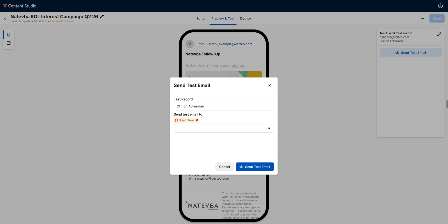
- Add the appropriate internal or external email addresses in the Send test email to field. The current user is automatically added.
- Select Send Test Email.
The email template is sent to the entered email addresses, account related tokens resolving based on the selected Test Record.
Deploying Content to Vaults as
Content Creators
Once content has been created and tested, or once content has been updated to a new version, content creators can deploy the content to connected instances of Vault CRM, PromoMats, or MedComms:
-
Navigate to the appropriate piece of content.
-
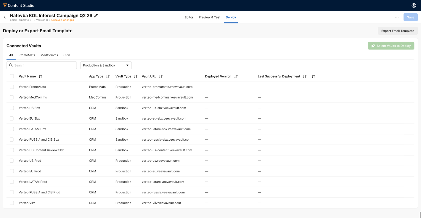
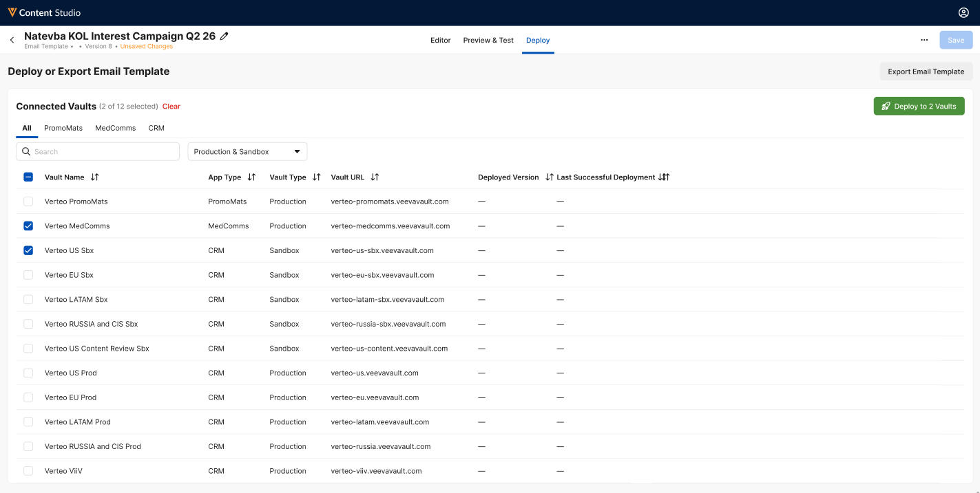
Select the Deploy tab. The list of connected Vaults displays.
-
Use the following functionality to identify the appropriate Vaults to deploy to:
- Vault Type Selector – Enables filtering the list of connected Vaults based on the Vault’s App Type (for example, PromoMats or CRM)
- Search for the appropriate Vault
- Production & Sandbox Selector – Enables filtering the list of connected Vaults based on if the Vault is a production or sandbox instance
- Select column headers to sort the list
- Select Vaults with Deployments – This option only displays for content that has been previously deployed to one or more Vaults. Select this button to automatically select all Vaults with an existing deployment. This option is useful when deploying new versions of content.
-
Select the checkbox next to the appropriate Vaults.
-
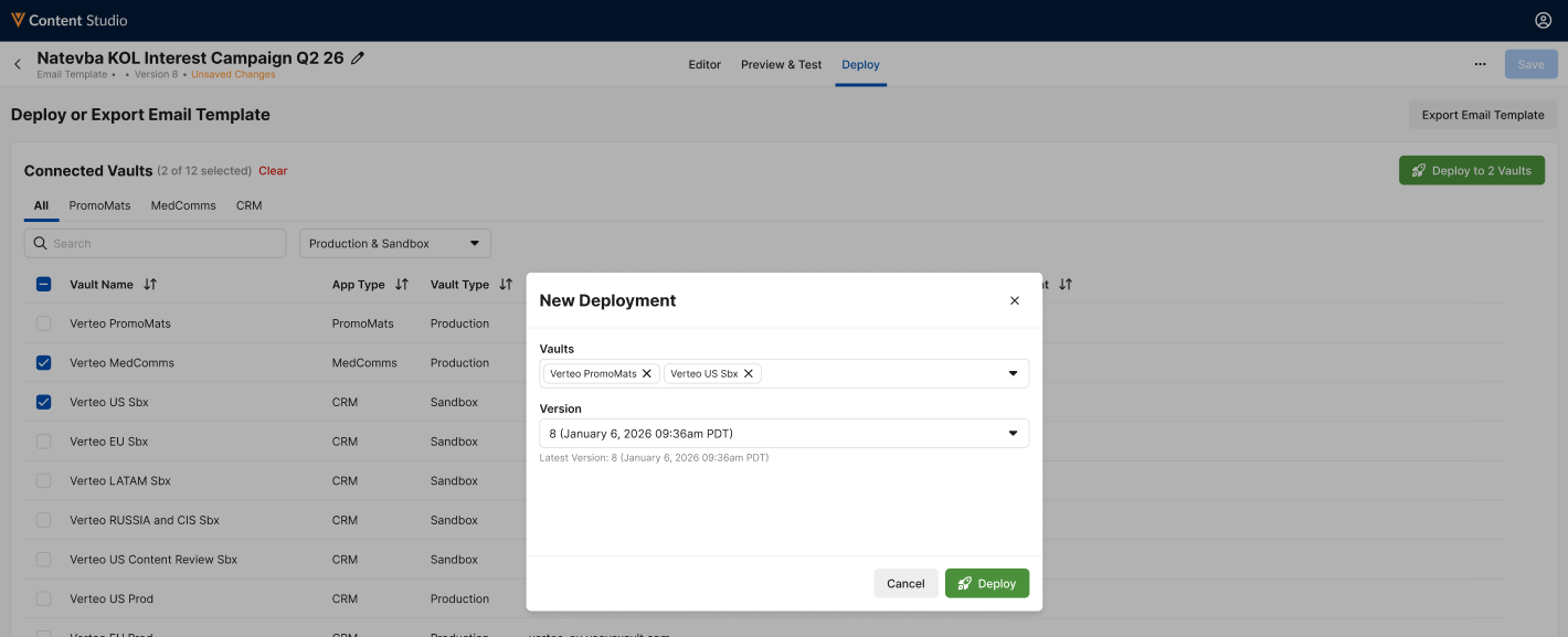
Select the Deploy to Vaults button. The New Deployment modal displays.
-
Verify the selected Vaults and content version.
-
Select Deploy.
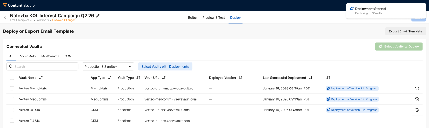
The deployment status displays for each Vault, enabling users to view the status and version of the ongoing deployment.
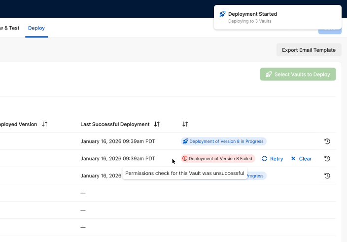
If an error occurs during the deployment process, users can hover over the failed pill for a brief description of the failure’s cause, as well as the ability to clear or retry the deployment to that specific Vault.
Export Content
From the Deploy tab, content creators can also export a local version of the selected content by selecting the Export button in the header bar. This downloads the content as a .zip file named after the component, containing the following files:
- The source HTML file
- assets.zip – Includes any images or other assets used in the content
- The Details CSV file – Describes the details and properties of the content