Defining X-Pages Layouts
Content creators can use display elements in X-Pages Studio to customize the page and arrange the layout and format of an X-Page, allowing them to control how data displays to end users in Vault CRM. In addition, content creators can add navigation actions to display elements to create interactive and responsive pages.
Who can use this feature?
- Content Creators - Browser
- Adding and Previewing Display Elements
- Adding a Table Display Element
- Adding Navigation Actions to Display Elements
- Adding Edit Record Navigation Actions to Display Elements
- End Users - iPad
- Using Display Elements
- Users do not require an additional license
Configuring Display Elements for
 Content Creators
To configure this feature, ensure Configuring X-Pages Studio is complete.
Adding and Previewing Display Elements as
Content Creators
Only pages created in X-Pages Studio can be edited.
This feature is not supported for the Call entry point.
The following display elements are available.
|
Description |
|
|---|---|
| Date Picker |
Displays a date picker from which users can select a date to filter displayed options. A default value can optionally be added. Do not use Date Picker in a WHERE clause of a query. This can result in displaying incorrect data. |
|
Directory |
Displays lists of people in an organized layout.
|
| Dropdown |
Displays a drop-down list from which users can select a single text value to filter displayed options. |
| Field List | List of labeled values from various data elements. Can select the format style for the labels and values. Can select an icon to display next to each label. |
|
Header Text |
Adds large text to an X-Page using a large, bold style. Text is left-aligned and matches the platform styling. |
|
Image |
Adds images to an X-Page. Images display in the data palette as a thumbnail. When selected, a modal displays the full-size image. |
| Metric Highlight | User-defined metric displaying a label in a small font and its corresponding value in a larger font for emphasis. Can add a second metric in small font. Can select an icon to display next to each label. If the metric value is a Number, users must define the number of decimals to display. If the metric value is a Date, users must define the date format. |
|
Pipeline Chart |
Classic funnel chart. Users should specify the desired display order for the stages. If the stage order is not specified, stages display in the order the query returns records. Each stage displays the aggregated value of that stage and all stages after. Users can select the chart color from available options. |
| Progress Chart | Single-item chart displaying progress towards a goal value. Can allow the progress to exceed the goal value. |
| Section | Section to group display elements. Can include a title. Can select an icon to display next to the title. |
|
Space |
Allows users to add a section to a layout where additional empty space is desired. No configuration is required. |
| Table |
Table displaying data from a specific data element with user-defined columns. The output for the selected data element must be a list of records. See Adding a Table Display Element for more information. For number columns users can select number formatting and select between two styles:
Can select the User Sortable checkbox for any column in the table to define which columns can be sorted by users when viewing the deployed page. Can display date fields, which require date format strings. See the Format Date expression for more information. Content creators can display date fields, which require date format strings. Large numbers of records display in tables using pagination. |
| Trend Chart |
Line chart displaying data from a specific data element changing over time. The output for the selected data element must be a list of records. Multiple trends can be displayed. To display multiple trends on the same chart, select the ‘I have multiple series of data’ checkbox and populate the Series field with the appropriate data source field. Users can select between two styles:
|
|
Can be added to any X-Pages content type that supports executing suggestions, for example, Account or Territory. Content creators can add this element to a layout to display a grid of suggestions. |
|
|
Text |
Adds small text to an X-Page in a paragraph style. Supports Rich Text fields. |
To add a display element:
-
Log into X-Pages Studio.
-
Select or create a page.
- Select the Layout tab.
- Select Configuration.
- Select and drag a display element to the blank canvas. Release the element when the appropriate position is highlighted. Available positions for an element are marked by dotted lines.
- Enter the appropriate information for the display element. Use expressions to refine the data and select the View Actions dropdown menu to add user actions, if needed. Optionally, populate the Description field to help easily identify the element.
- Select OK.
- Adjust the width of the display element as needed.
- Select Preview to view the formatted page. Preview often to ensure the page displays as expected.
User actions display as links in the display preview. Content creators can select a user action link to view a popup describing the action that occurs for end users and ensure the action is correct.
After defining the page layout, content creators can deploy the page to Vault CRM for testing or use. See Deploying Pages to Vault CRM Using X-Pages Studio for more information.
Adding a Table Display Element as
Content Creators
To add and configure a table:
- Select and drag the Table display element into position on the layout.
- Select a Data Source.
- Enter a Description. This step is optional.
- Configure Columns:
- Select Add Column
- Select the Header and Value (field selection)
- Select the View Action toggle to allow navigation to a record or another X-Page section. This step is optional. See Using the View Section Navigation Action for more information.
- Select the Column Aggregation toggle for numeric fields. This step is optional.
- Select Sum
- Repeat adding columns as needed
- Configure Sorting (optional):
- Select the Default Sort toggle
- Select a default sort column to automatically sort the table by this column when a user first navigates to the page. All columns can be re-sorted by end users.
- Select the Sort Type: Ascending or Descending
If the data source is sorted in the data palette, you should choose the field the data source is first sorted by. All other sorts are still respected. If you choose a field different from the field the data source is first sorted by, the data palette sorting is disregarded.
- Configure Pagination:
- Select the Pagination toggle to enable record limits per page. This step is optional.
- Select 5 Rows Per Page or 10 Rows Per Page from the Display dropdown
Using Display Elements as
End Users
End users can interact with enhanced tables to view aggregated data and navigate through record sets. The following features are available:
- If pagination is enabled, users can view the Record Number Viewer (for example, 1-5 of 10) and use the Page Selector to navigate through records
- Users can select a column header to sort the table by that field. All columns are sortable, however, multiple column sorting is not available.
- When users navigate away then return to the page, sorting resets to the default sort (if specified)
- Numeric columns display summed values in the Total row at the top of the column, if enabled.
If a default column was selected, and the table data is sourced from a sorted data list, data palette sorting is applied first, then sorting by the selected column is applied.
Adding View Record Navigation Actions to Display Elements as
Content Creators
Content creators can add user navigation actions to display elements to create interactive and responsive X-Pages.
Using more than 20 navigation targets is not supported.
Using the View Record Navigation Action
The View Record navigation action allows users to navigate directly from X-Pages content to a data record. Content creators can add View Record for the following objects:
- Account
- Call
- Call Objective
- Medical Event
- Medical Insight
- Medical Inquiry
- Case
- Competitor
- Opportunity
- Opportunity Line
- Opportunity Competitor
- Opportunity Team Member
- Action Items
- Sent Email
- Custom Objects
Content creators can add a View Record navigation action to the following display elements:
- Section – Available if a header is included. Displays the section header as a link to a data record.
- Table – Available for each column. Displays each value in the column as a link to a record from the selected data source.
- Field List – Available for each field. Displays a value as a link to a data record.
- Metric Highlight - Available for each value. Displays the value as a link to the data record.
- Directory - Available for each record. View record is enabled by default.
To add a View Record navigation action to a display element:
-
Log into X-Pages Studio.
-
Select an X-Page.
-
Select the Layout tab.
-
Select the appropriate display element on the layout.
-
Select the edit icon next to the appropriate display element.

-
Select the View Actions drop-down menu.
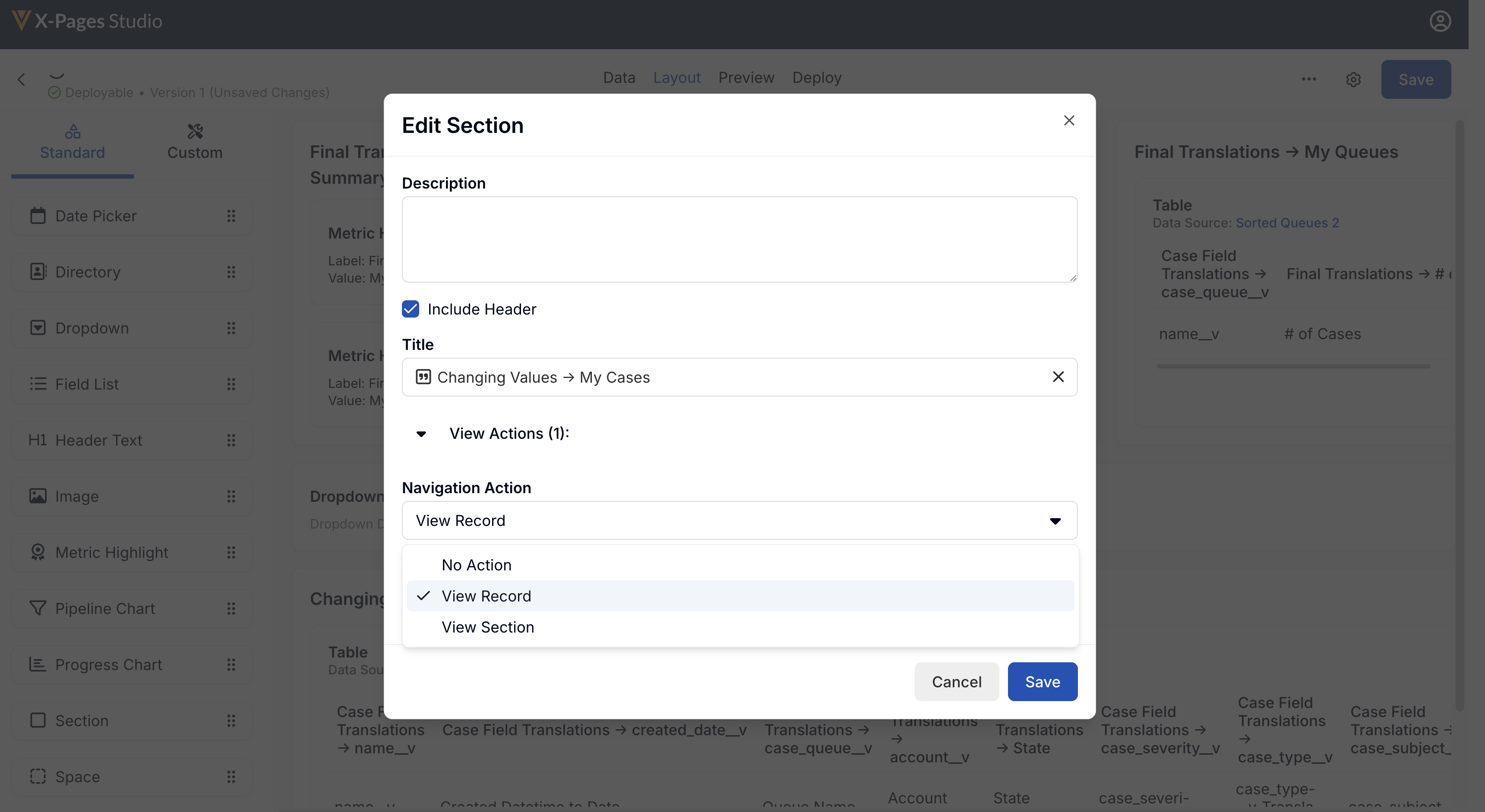
- Select the Navigation Action drop-down menu.
- Select View Record.
- Select the appropriate record ID for the target record from the Record ID lookup field.
- Select the appropriate X-Pages Tab(s) as the navigation target(s). This step is optional and only available if the object for the target record is Account.
Ensure end users have Read permission to the studio_id__v field on the html_report__v object.
- Select Save.
Using the View Section Navigation Action
Only valid for the Account or Territory page type.
To add a View Section navigation action to a display element:
-
Log into X-Pages Studio.
-
Select an X-Page.
-
Select the Layout tab.
-
Select the appropriate display element.
-
Select the edit icon next to the appropriate display element.
-
Select the View Actions drop-down menu.
- Select View Section from the Navigation Action drop down menu.
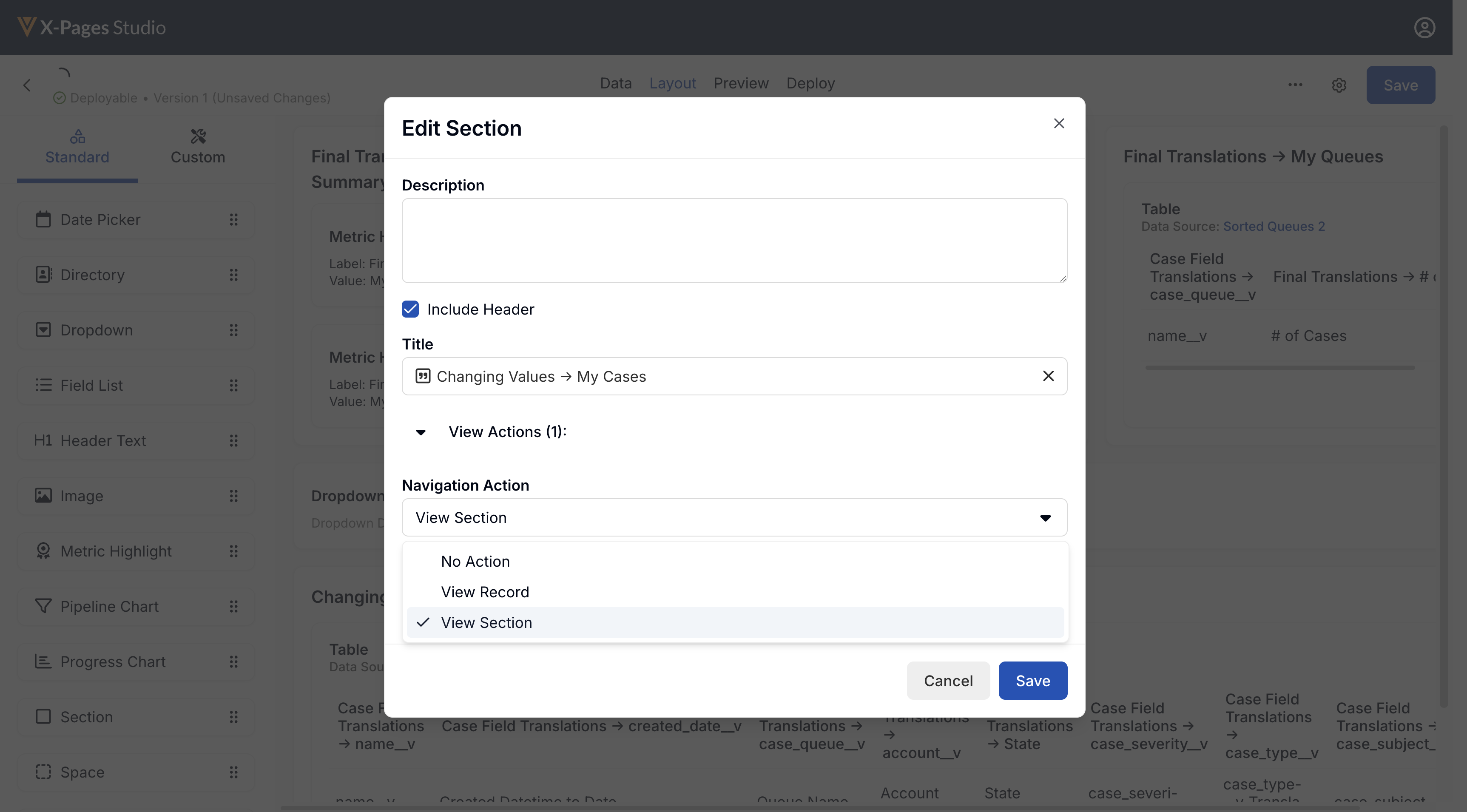
- Select the appropriate X-Pages Tab(s) as the navigation target(s).
- Select Save.
Navigation is only permitted from Account to Account, or from Territory to Territory.
Ensure end users have Read permission to the studio_id__v field on the html_report__v object.
Adding Edit Record Navigation Actions to Display Elements as
Content Creators
The Edit Record navigation action navigates users directly from X-Pages content to the standard edit screen for the object. The object type is determined automatically from the record ID.
Content creators can add the Edit Record navigation action to the following display elements:
-
Section - Available if a header is included. Displays the section header as a link to the object’s edit screen.
-
Table - Available for each column. Displays each value in the column as a link to the edit screen for the row’s corresponding object.
-
Metric Highlight - Available for each value. Displays the value as a link to the object’s edit screen.
The Edit Record navigation action is available in all page types that support deep linking. See Using Deep Linking in X-Pages for a full list of supported entry points.
Browser supports the editRecord method which navigates users to the standard edit screen for the requested object. If the user only has view permissions, the method navigates to the standard view screen instead.
To add an Edit Record navigation action to a display element:
-
Log into X-Pages Studio.
-
Select an X-Page.
-
Select the Layout tab.
-
Select the appropriate display element on the layout.
-
Select the Edit icon next to the appropriate display element.
-
Enable the View Record toggle.
-
Select Edit Record from the Navigation Action drop-down.
-
Select the appropriate record ID for the targeted record from the Record ID field.
-
Select Save.